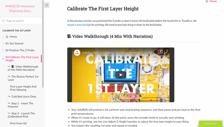
My one-man-documentation show. I produced everyghing from writing to photography and graphics to coding the website and publishing it via Github pages. It turned out nicely.
Highlight: Auto-playing tiny mp4 videos in place of gifs
I'm quite proud of this one. For hands-on documentation, videos are amazing, but inefficient. They are slow to consume, cannot be skimmed and cannot be searched.
I think a combination of text (efficient) and animations (short video, no audio) are often perfect. You can show someone how to hold a tool and manupulate an object in five seconds. Show, dont’ tell 👀.
However, gifs are an ancient format that slows down the whole site. Here, I managed to emulate the look and feel of a gif animation with a self-playing control-less short mp4 videos at a fraction of the size.
I put black sides with CSS to these ‘gifs’ so that they look more like videos and so that they are easy to see when skimming the document - as they usually convey important information and should not be skipped.

The Story
Documentation, manuals, and user guides are important for any product, but they are essential for educational products - they harbor a huge learning opportunity.
I originally picked Dozuki to build IMADE3D documentation. It seemed to be a good fit. It's SAAS, which I wanted, and it's the same system that powers iFixit, which is one of the biggest repair manual sites online and one of the most vocal defendents of Maker culture and the Right to Repair.
However, the system is not designed for efficiency. It looks good to the users, but it's extremely limited in ways it can be set up and the backend administration is feature poor and slow.

Enter plain text documentation.
Tired and slowed down by all these limiting, heavy handed authoring systems, I ran straight into the trendy arms of self-hosted plain text websites.
There are many (many) plain text systems out there, some even specializing in docs. Readthedocs, Sphinx, Vue, Hugo, Docusaurus… but they all take time to learn and set up and evaluate.
Docusaurus is different.
The sidebar and fancy capabilities get generated on-the-fly with javascript. That's an amazingly portable prototyping tool.
While I threw the site together as a prototype, expecting a switch to some bigger and meaner system like Docusaurus, who knows - I'm really happy how this simple site turned out and in no rush to switch.
